Above is my design for the Quantum Integral Healing Arts logo.
Located in the San Francisco Bay Area, Quantum is a healing practice fusing Eastern and Western medical thought and philosophy to inform their treatments.
From psychiatry to psychotherapy to ketamine-assisted psychotherapy to acupuncture to Mindfulness-Based Cognitive Therapy groups, they offer a wide range of options to treat our patients' body, mind, and spirit.
They work to help patients reach their fullest potential; to thrive and not just survive.

Below is my process design process for creating Quantum's logo and branding. I've also included my process in creating a Style Guide and business cards for my Client.
This serves as a case study for how I help Clients to crystallize their values and express their brand through design.
CREATIVE BRIEF AND BRAND VALUES
A great logo captures the heart and soul of a brand, is the customer's first impression, and differentiates a company from its competitors.
To create a logo that sings, a designer must truly understand a company's strengths, values and vision.
During an initial meeting with my Client, I asked her quite a few questions to really get to know the company and establish an assignment for myself (a Creative Brief) for designing her logo.
My questions ranged from the practical (Where will your logo live – online, on signage and printed materials – where else?) to the conceptual and expansive (How do you want your company to be perceived internally and externally? Why are you REALLY in this business – what are your loftiest goals? Where do you see your company in 2-5-10-20 years?)
From there, I distilled her responses into a Creative Brief (design assignment) for myself, and a set of Brand Values that exemplify all that she hopes to convey with her new logo. Brand Values are four to five words that express the essence of the brand at a high level. These are values that probably won't change over time.
It's important to establish a Creative Brief and Brand Values so there's a North Star for the project. It helps focus my designs on what's truly important, and helps the Client have a template to judge designs by. Graphic design can be abstract, and these tools allow it to be more concrete and measurable.

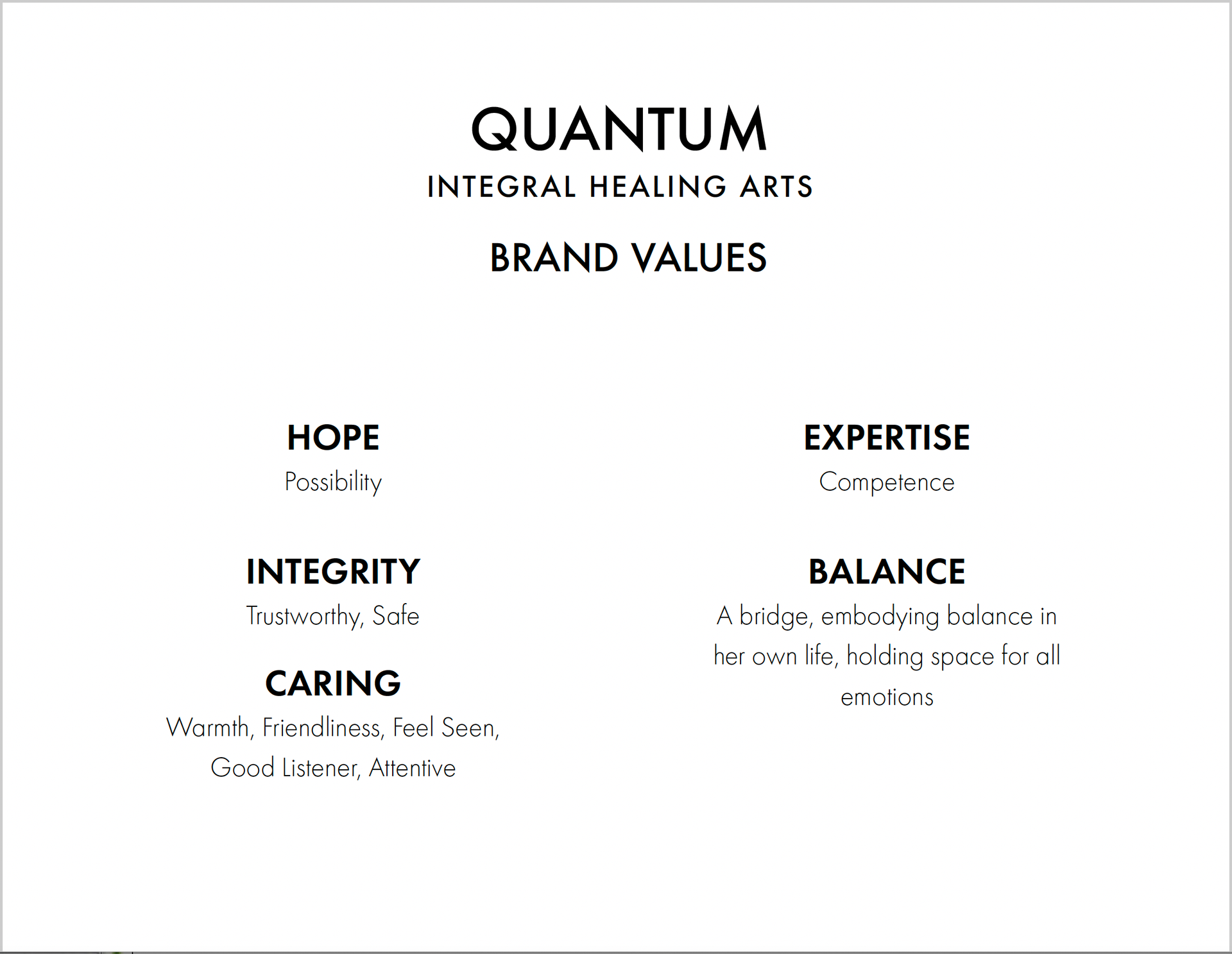
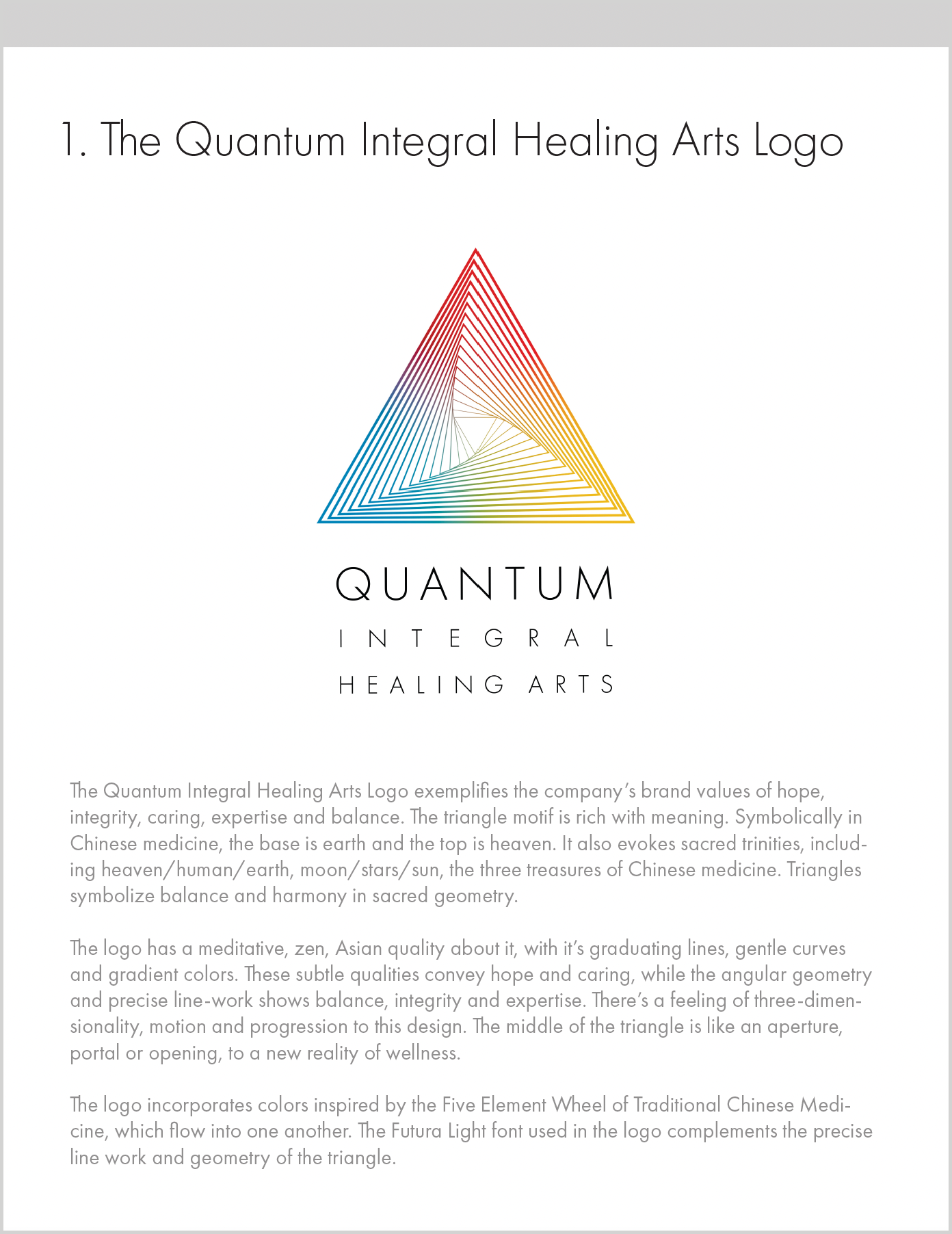
Quantum Integral Healing Arts' Brand Values (a page from my presentation to the Client)

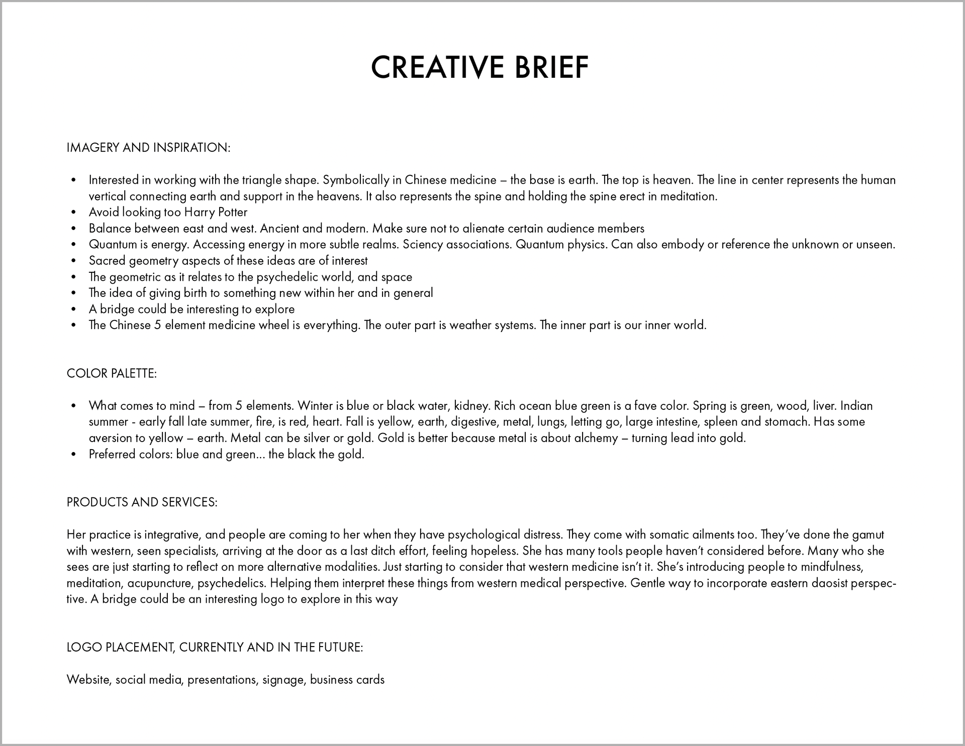
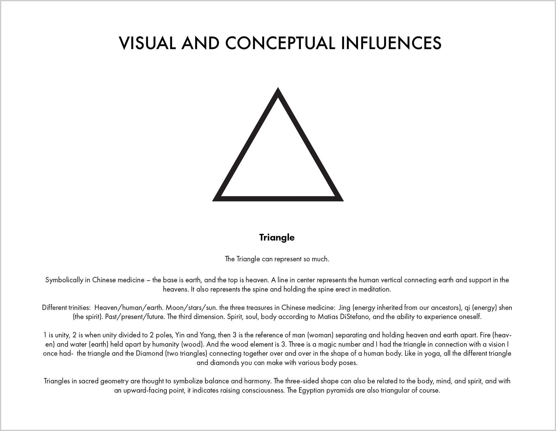
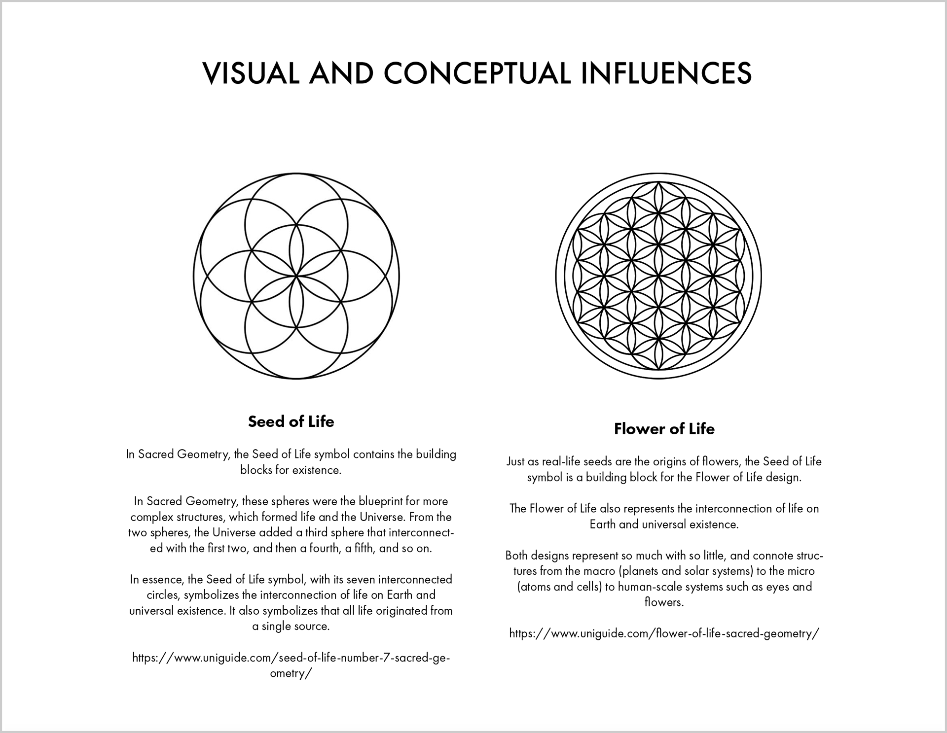
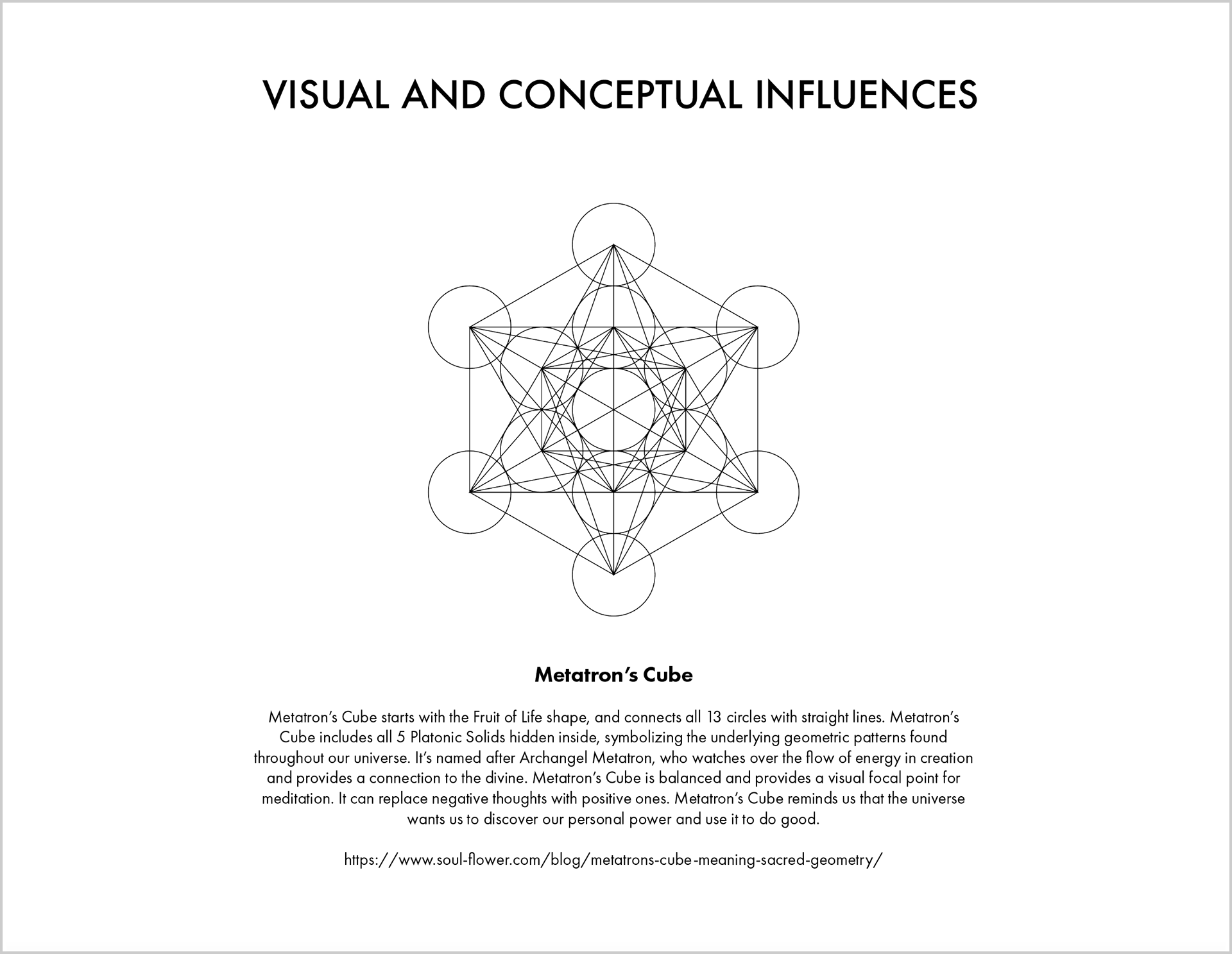
These are a few elements from the Creative Brief we used for this project. The brief was based on my conversation with the client, and included details of what she wanted included or considered in the logo design. The actual brief was about twice as long and included information such as competitors and future plans for the company.

   
RESEARCH AND MOOD BOARD
Once we were in agreement on the Creative Brief and Brand Values, it was time to start the research process.
My next step was to research visual forms and imagery for the designs, and create a mood board to give some ideas for concept, look and feel of the identity. These were based on our discussions and sharing about the project.
As you can see, sacred geometry was a huge influence on our ideas about the logo. 

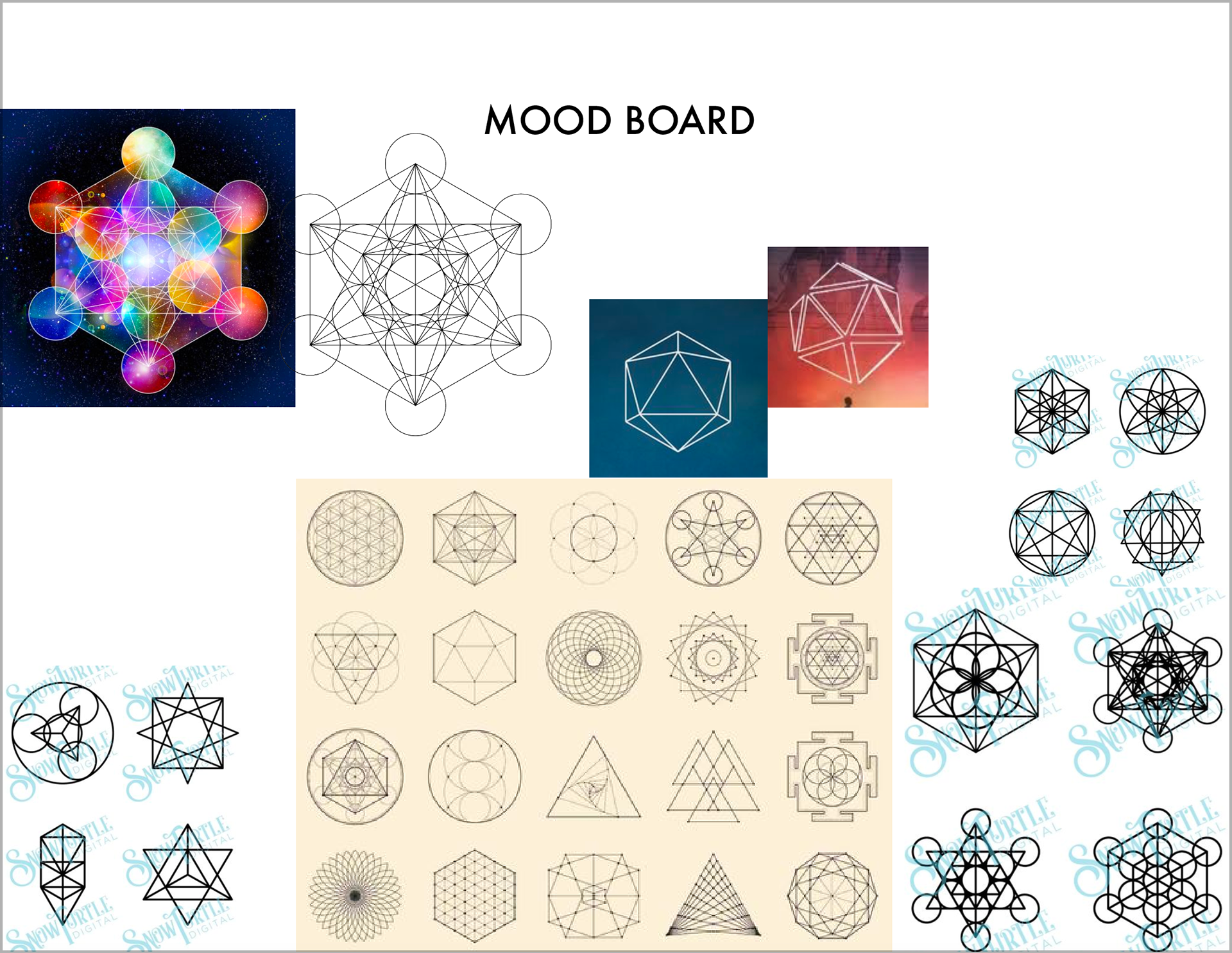
Quantum Integral Healing Arts Logo Design Mood Board (a page from my presentation to the Client)

My Client was happy with the mood board.
I elaborated on specific visual and conceptual influences that were particularly relevant to this project and logo design.
   
INITIAL DESIGN OPTIONS
From there, I began designing several initial options for Quantum's logo design, based on the Creative Brief, Brand Values and mood boards.
At this stage of the project, I create several unique design concepts for the Client to choose from.
Designs aren't refined or perfected at this stage, but they get the idea across!

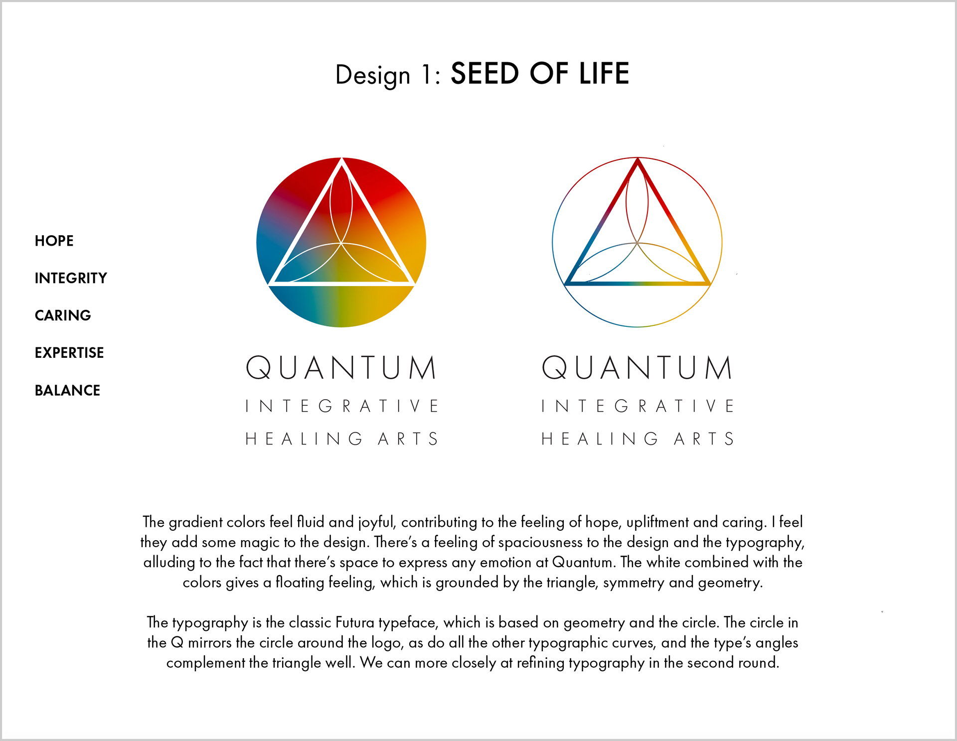
Design 1: Seed of Life (a page from my presentation to the Client)

Above you can see a page from the PDF presentation I presented to my Client. Within the presentation, I outlined the ways that this concept exemplified her brand values and our creative brief.
Design 1, "Seed of Life," features a triangle holding three petals of the Seed of Life (a sacred geometry form).
•  The triangle is strong and solid, and has all the wonderful connotations of triangles and trinities, as well as conveying the feeling of integrity and expertise.
•  The seed of life looks a little like a flower or lotus, connoting the idea that Quantum will help patients evolve and flower.
•  It carries the harmonious energy of the flower of life. The idea of the “seed of life” feels hopeful and life-affirming.
•  Curving lines gently and elegantly connect each point of the triangle, and add some softness and femininity to the design.
•  There is a three-way symmetry to this design, creating feeling of balance, precision and stability.
•  Masculine and feminine, and angular and curvilinear are also balanced here.
•  East and West, and ancient and modern are represented with the geometric floral, and the modern precision of the lines.

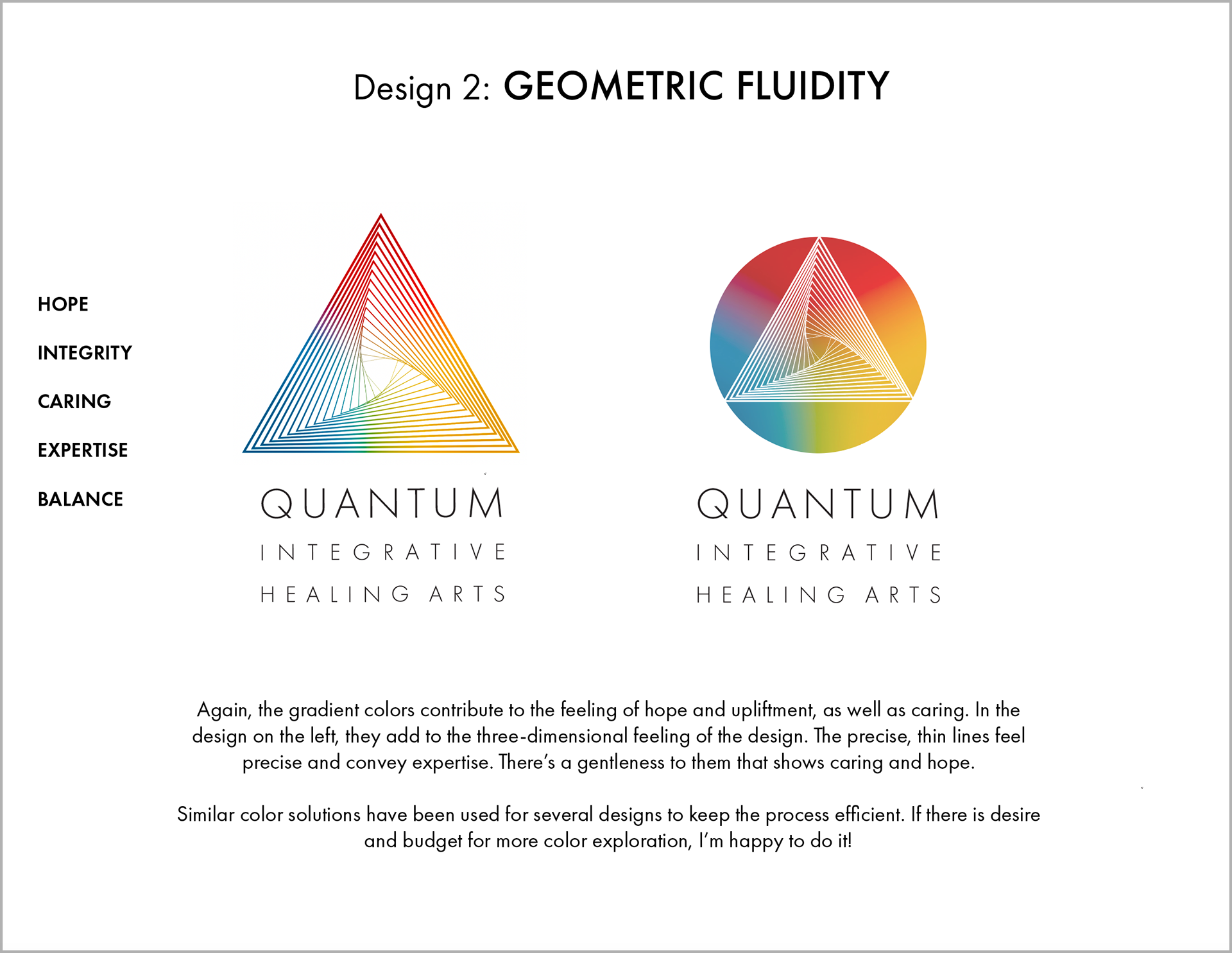
Design 2: Geometric Fluidity (a page from my presentation to the Client)

Design 2, "Geometric Fluidity," has a meditative, zen quality about it, with its graduating lines and gentle curves.
•  The softer qualities convey hope and caring, while the angular geometry and precise line-work shows balance, integrity and expertise.
•  There’s a feeling of three-dimensionality, motion and progression to this design. I also like the idea of someone achieving their goal, step by step, with Quantum.
•  The middle of the design is like an aperture, portal or opening, perhaps to a new reality of wellness.
•  The triangle of course has all the wonderful connotations of triangles and trinities.
•  The design has it’s own kind of symmetry and almost a yin-yang quality, creating balance.
•  It feels modern and Western yet also and Eastern, and reminds me of Japanese designs. 
•  And there’s the duality of gentle curves to complement the angles.

Design 3: Frequency (a page from my presentation to the Client)

Design 3, "Frequency," uses graduating lines of gradient colors, which are reminiscent of a tranquil, abstract Asian landscape.
•  They also give a feeling that something is being revealed, as each layer is peeled.
•  They connote different parts working in harmony to create a whole, kind of like the way Quantum's practice combines psychotherapy, Chinese medicine and ketamine therapy, to create a gestalt, where the whole is greater than the sum of the parts.
•  We have all of the connotations of the trinity, the symmetry showing balance, and some asymmetry give some dynamism.
•  Hope is on the horizon, and the curves give an embracing, caring feeling.
•  Precise lines show expertise and integrity.

Design 4: Metatron Flower of Life (a page from my presentation to the Client)

Design 4, "Metatron Flower of Life" is derived from Metatron’s Cube, a sacred geometry form.
•  The triangle and flower of life are easy to see here, and many elements of Metatron’s Cube are present.
•  Although it uses familiar aspects of sacred geometry, it’s a unique, new and compelling composition.
•  This design is more complex than some of the others, and shows the trinity through multiple elements, both angular and curved. It’s multifaceted, engaging, and interesting to study as you take in all the details.
•  The flower motif feels bright and joyful, conveying hope, friendliness and caring.
•  The symmetry creates balance, and the precise lines show expertise and integrity. The vertical line can be seen in this design.

REFINEMENT AND PERFECTION
My Client selected Design 2, "Geometric Fluidity," to move forward with.
I perfected the design by refining the geometry, lines and typography of the design, and making sure the gradient was spot on.
As it happened, the original digital sketch for Geometric Fluidity (shown in step 3 in this process) looks extremely similar to the final, refined logo. This isn't always the case – sometimes there's more refinement to do at this stage.
The main version of Quantum's logo is the vertically oriented one, with type stacked under the mark/logo. I created a horizontal version for instances where using a more horizontal logo is advantageous. And I created a version of the logo optimized for web use.
Below, you can see the final logo lockups!

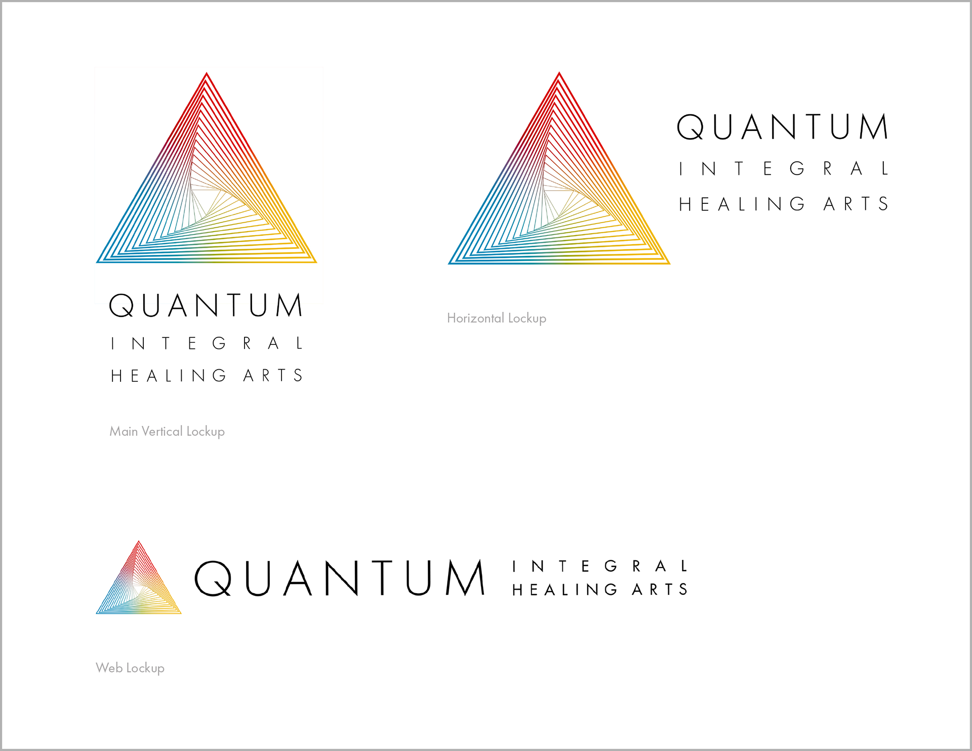
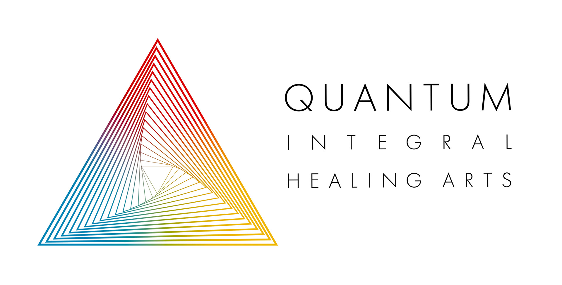
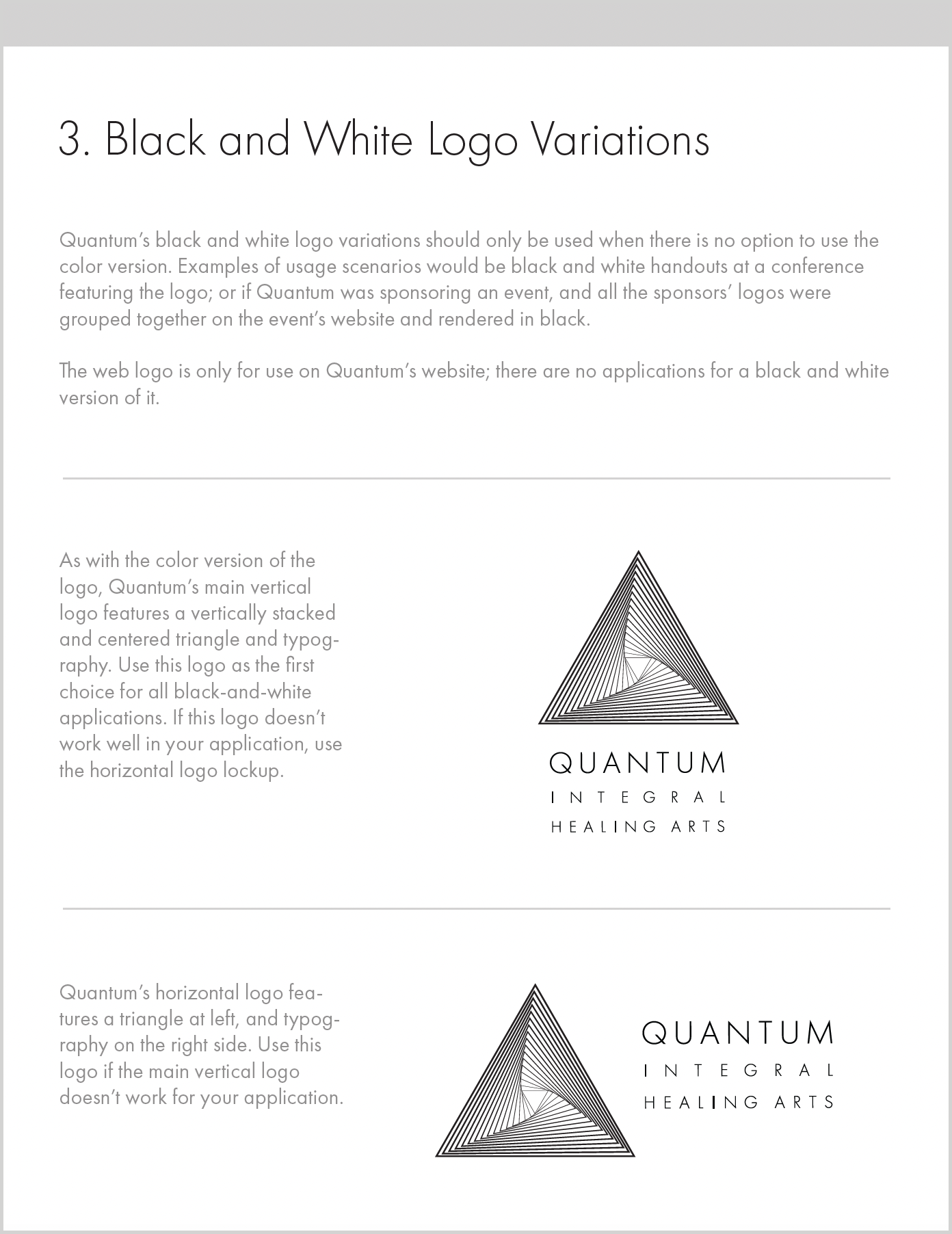
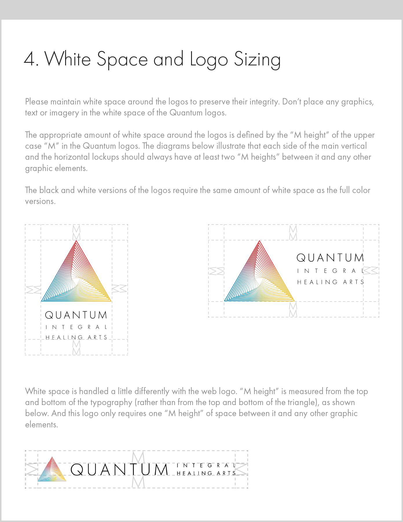
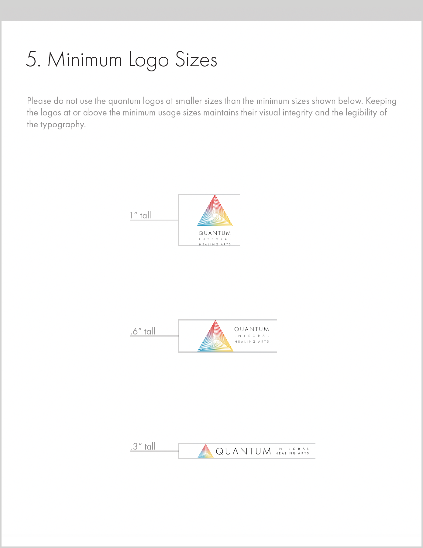
Quantum's three final logo lockups (a page from my presentation to the Client)

   
DELIVERY OF THE FINAL LOGO FILES TO THE CLIENT
The logo design is complete, and my Client loves it!
I sent her the final logos in easily-usable digital formats, in color and black and white versions.
The Quantum Integral Healing Arts logo is serving her growing company well.

OPTIONAL NEXT STEP: CREATION OF A STYLE GUIDE
My Client desired a Style Guide to guide usage of the Quantum Integral Healing Arts Logo by social media managers, designers, printers or other folks using the logo. Below is a simple guide I created for them, which includes direction on which logo to use in a given situation, how much white space to leave around the logo, the smallest sizes the logo should be used, and what not to do with the logo.
As my Client's business grows, we can expand the Style Guide to allow for guidelines on elements like a color palette; typography, graphic and photography styles and more.
   
OPTIONAL NEXT STEP: CREATION OF BUSINESS CARDS
I designed business cards for Quantum, using the horizontal lockup of the logo.
On the bottom front of the business card is a pattern that was created by repeating and tiling the logo, then cropping it. In this way, the logo provides a cohesive, compelling and beautiful visual language for Quantum's branding.
The typography of the business cards is minimal and clean, keeping with the feel of the brand, and the type treatment of the logo.

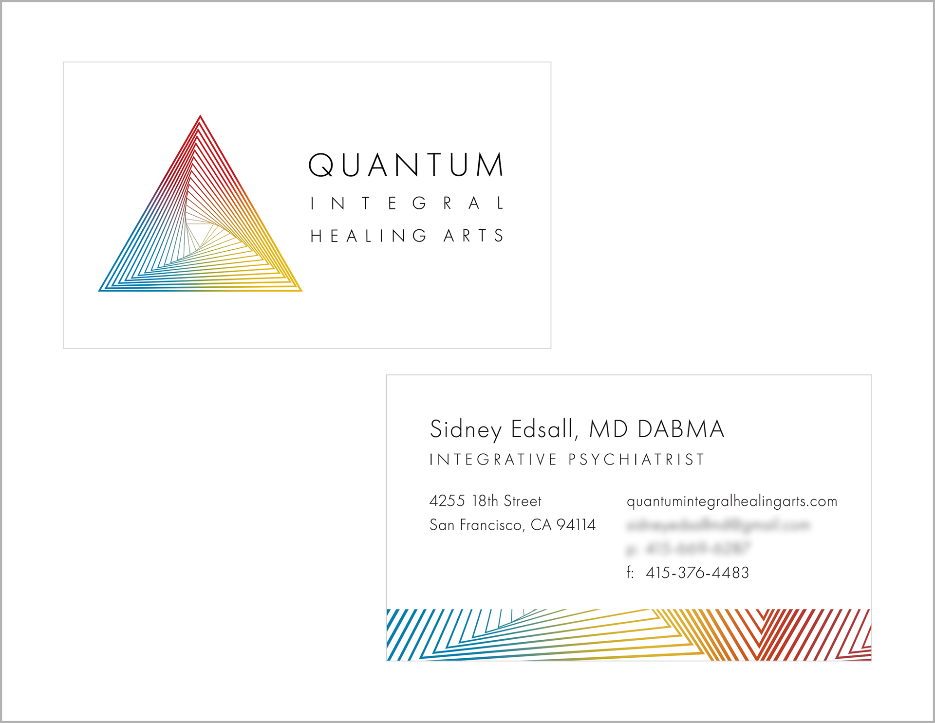
Quantum Integral Healing Arts' business card design

Back to Top